'Learning and Development' - a platform for the professionals/interns across the company, to grow up in their career.
Organization wanted to improve registrations and completion of courses. They wanted to eradicate the confusion around learnings and gain competitive advantage over industry peers and new 3rd party websites.
Upon launching a new site redesign, they wanted ease of use with seamlessly integrated advance learning capabilities and therefore higher conversion.
UX/UI Designer and Front End Developer (HTML, CSS, J-Query)
Research | Wireframe | Prototype | Visual Design | Front-End Development | Browser Testing | Usability Testing
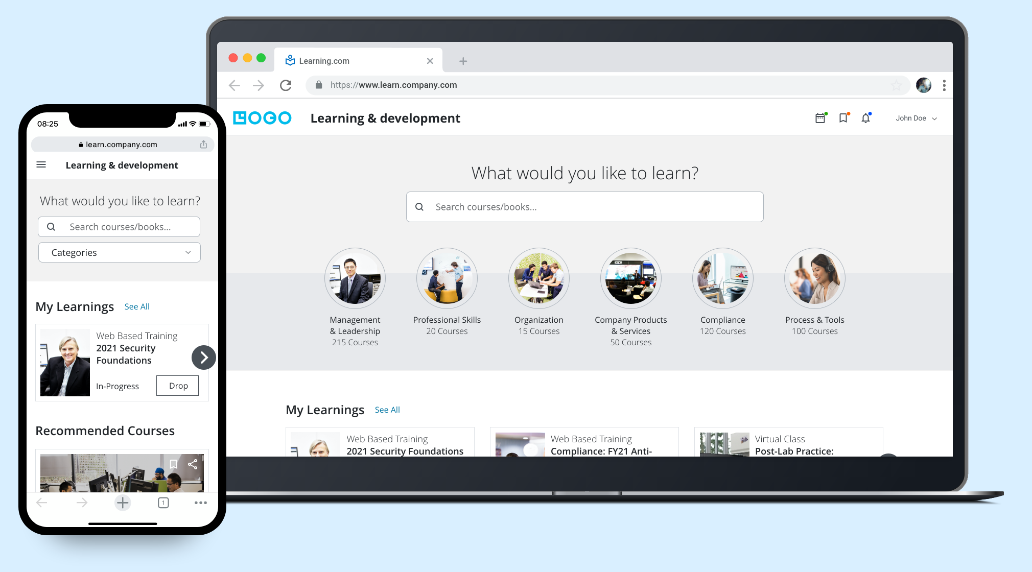
New Engagement Dashboard
Users should feel happy and enthusiastic on coming to internal learning portal and enroll to the courses.
Learning in the form of traditional teaching and e-learning both require self-discipline, motivation and acceptance of the methodology, whereby e-learning – in so far as it is used in isolation – relies more on intrinsic motivation.
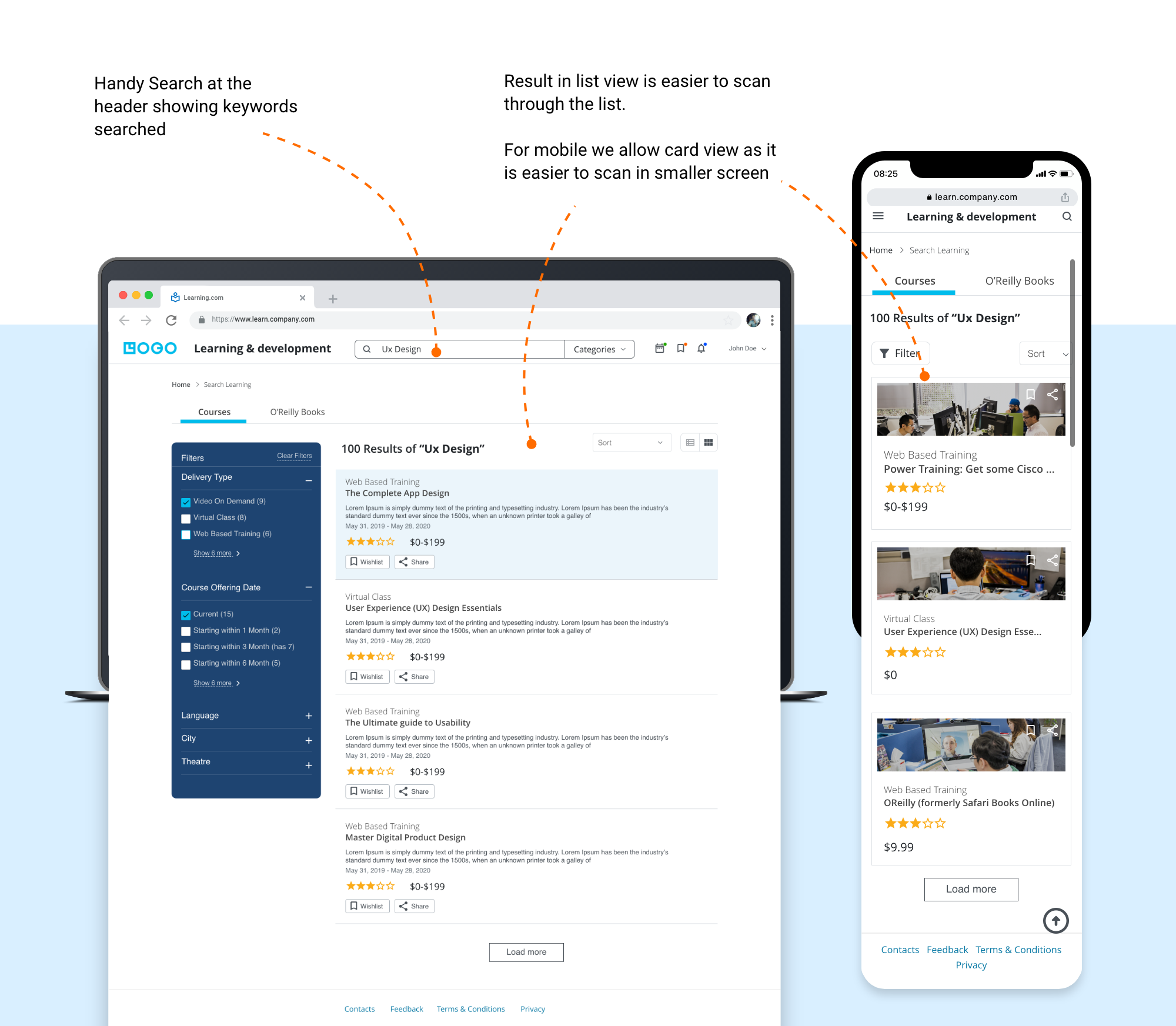
Information architecture is the core of the site. So needs to organize proper navigation system and searching ability as many user preferes to go with that.
Needs to attract user to the learning portal by giving some additional features and capabilities.
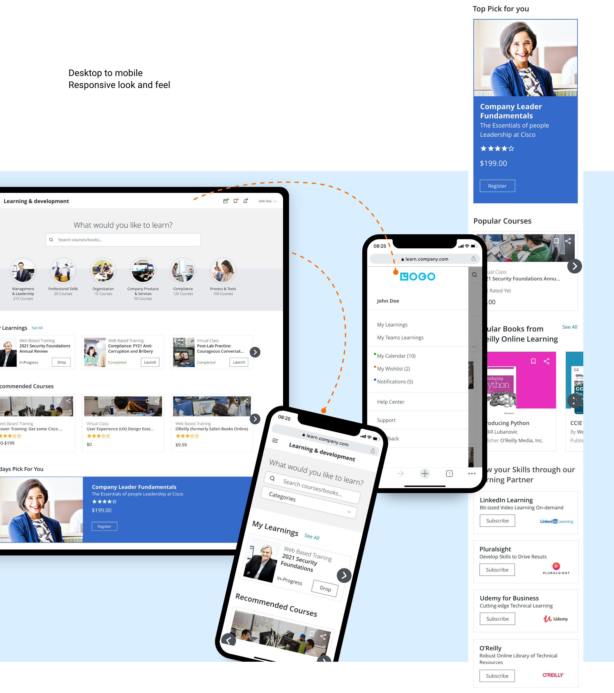
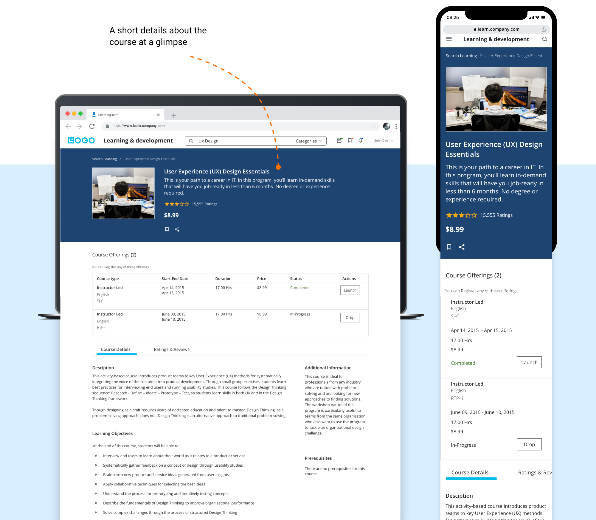
Make it available on all devices so user can access it through anywhere from any device.
App Audit
User Interview
Competitive Analysis
Define User Group
Task Analysis
Personas
User Flow Chart
Information Arch.
Lo-Fi Prototype
Hi-Fi Prototype
Visual design
HTML Prototype
Usability Testing
Executive Intent
Market Segment
General Tasks
Technological Constraints
Business/Marketing Goals
Critical Success Factors/Usability Criteria
To start with redesigning the app I wanted to understand the existing app’s different functionalities and overall architecture and navigation.
Here, I did an app audit to fully analyze and understand the app’s features and its usability. Throughout this process, I was able to identify some clear usability issues and pain points. Thus, in order to validate these observations, I needed to perform some user interviews.
And second step was before diving in and bringing my own solutions is to learn more about other learning solution provider applications, so I did a competitive analysis of those applications.
Information Architecture of old App
I interviewed five people who had difficulties in completing online courses. Below is the sample questionnaire asked in user interview
“It is hard to find out specific course out of so many listings, I even cannot bookmark the course”
“Course completion don’t give message, I have to find out learning history which is very tiny link present on find learning page. Don’t get proper notification of enrolled /completed courses”
L&D recommended competitors’ application was Udemy and Course-era, Lynda. We decided to focus our feature and layout analysis on other online learning platforms with high rates of course completion and user success.
We learned people were confused by navigation, duplicate buttons, not having proper feedback notifications and the overall course content organization in courses and tracks.
Also needed some motivation / encouragment to enroll and complete the learnings.
In my solution, I focused on the two main pain points that the research showed, which are
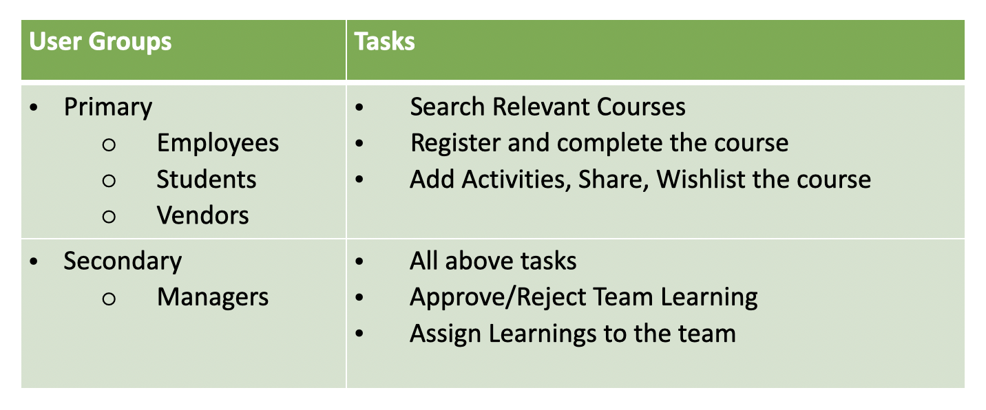
First I joted down User groups and their main tasks.
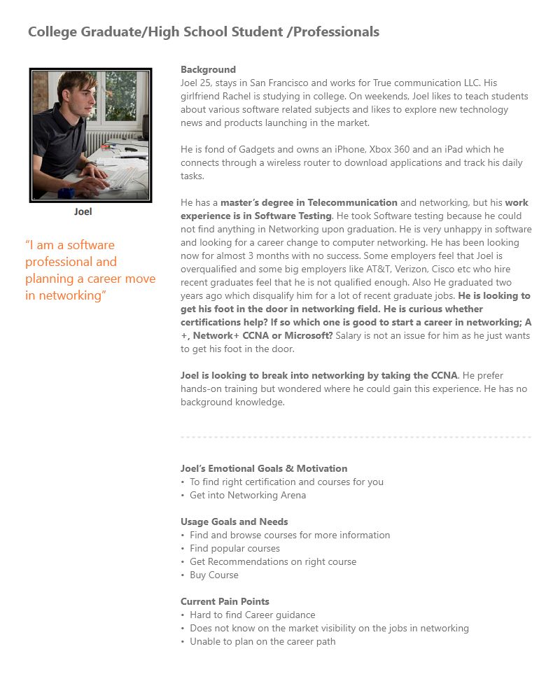
Created the personas based on the outcomes of the user research. It typically helps me to create something user-centric.
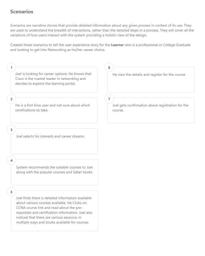
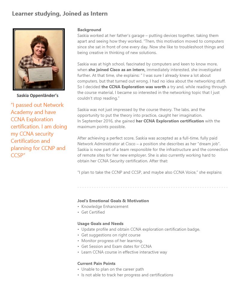
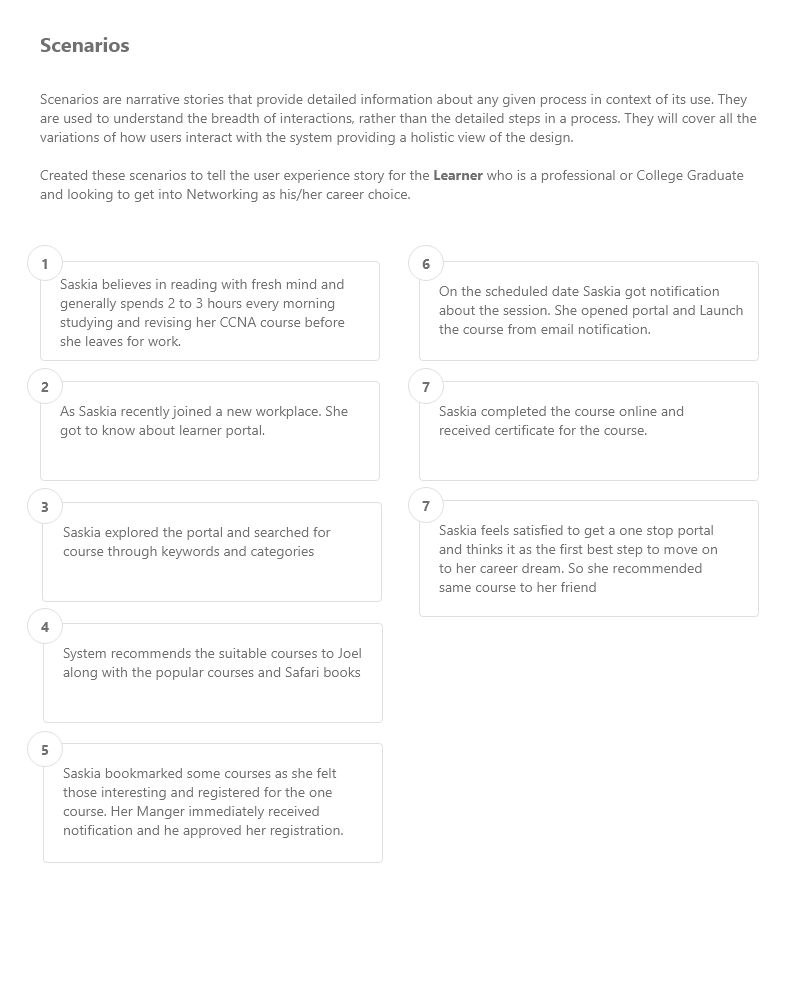
Up until now I had a vague idea of how the app will function. Mapping the basic flow of the app forced me to figure each step on the path the users will take throughout the solution. I first sketched it on paper and then digitally rendered it.
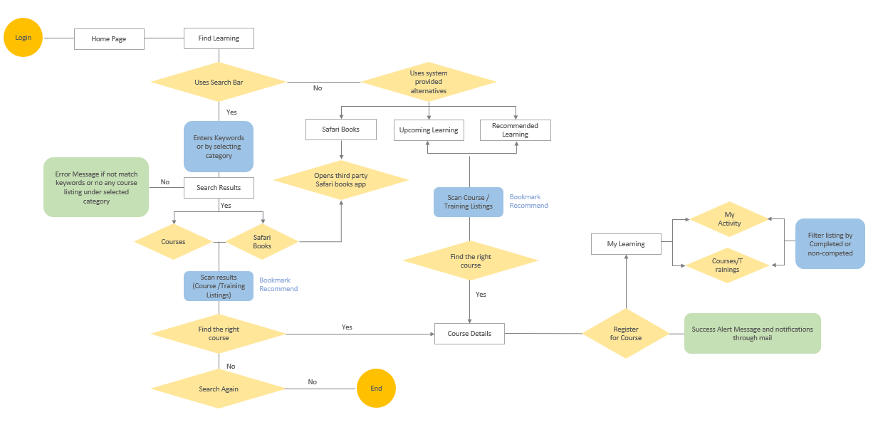
User Flow: Find and Register Learnings
Based on user groups and their tasks, I created a new Information Architecture.
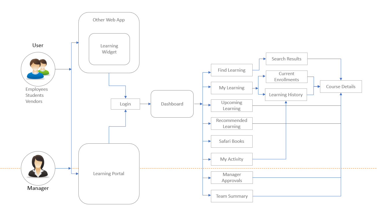
New Information Architecture
To clearly express and refine my ideas further, I created a paper prototype. Keeping two breakpoints created lo-fi wireframes for desktop and mobile screens .
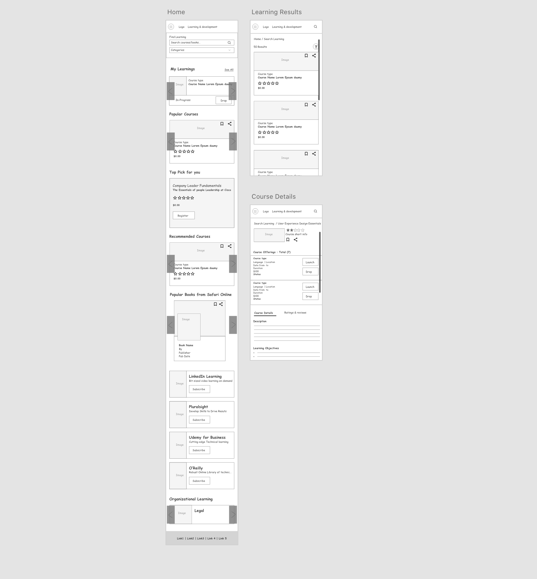
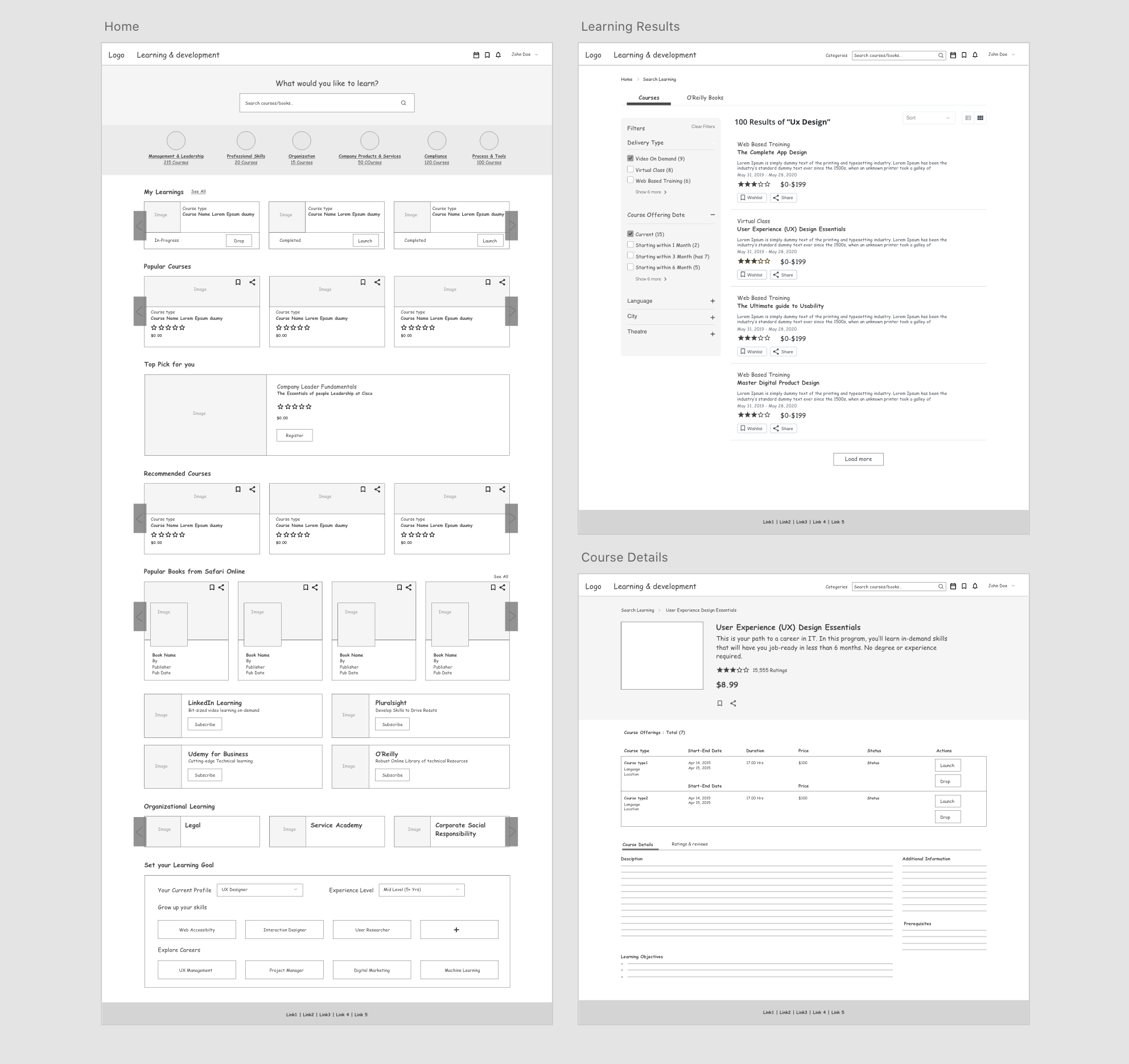
After having a go-ahead from the Product Manager, Stakeholders, and Developers on the mockups, we began to conduct usability tests with the low-fidelity mockups. Once all had confidence in the design, I started on digitalizing designs.
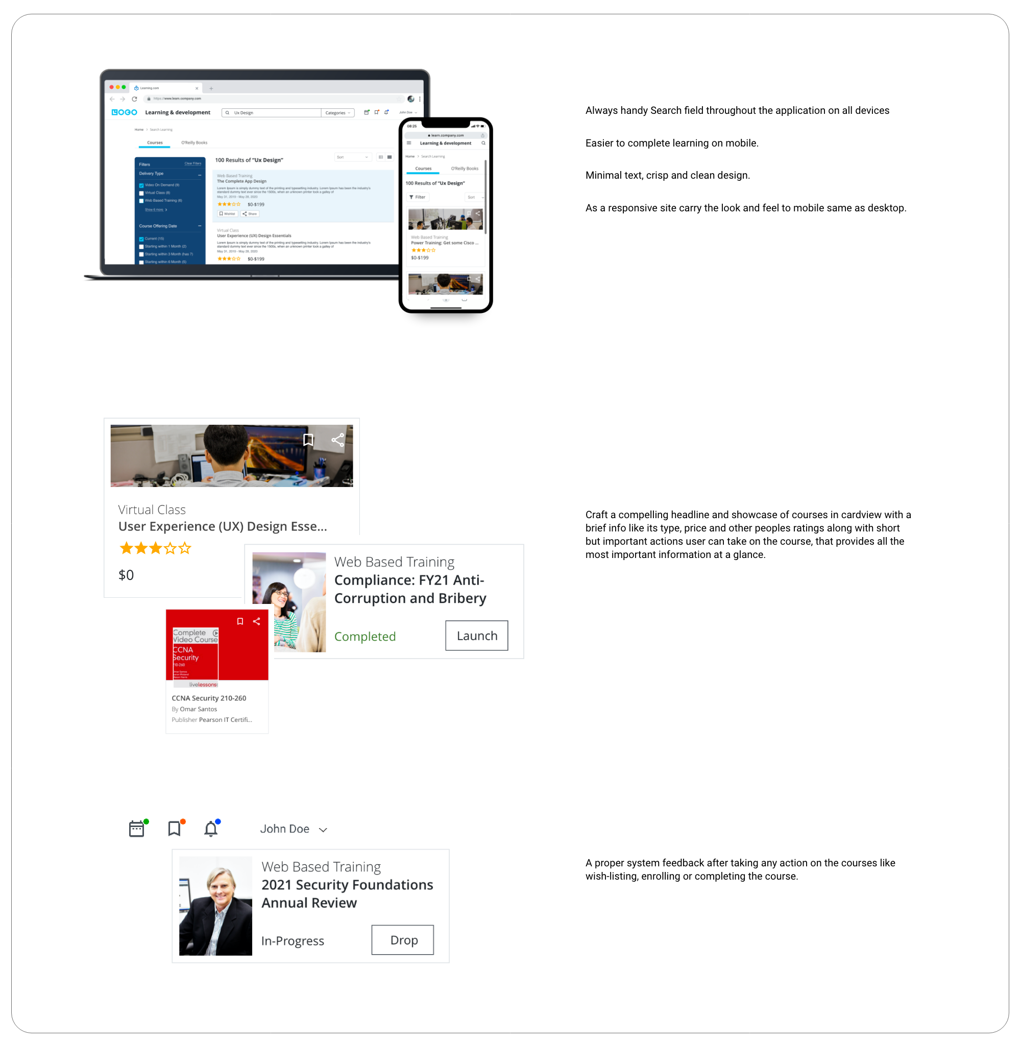
**Styleguides used as per organization's standards.
A few months from launch, Learning and Development was awarded by "Saba Customer Excellence Awards".
Congratulations on winning the 2016 Saba Customer Excellence Award in Enterprise Excellence. The Saba Customer Excellence Awards are designed to recognize and celebrate Saba Customers who are leaders and innovators in learning, development and talent management. By successfully leveraging the power of Saba Software you have not only elevated your company into the next level of learning and talent excellence, you¹ve become a stellar example that others will be inspired by and want to learn from.
Paige NewcombeChief Customer Officer, Saba

Best Use of Social / Collaborative Learning

Best Use of Video for Learning

Best Use of Blended Learning
Redesigning is challenging
As I was involved in the project right from the beginning until after it was launched, I got to experience the entire project life-cycle.
Aggregate. Curate. Design
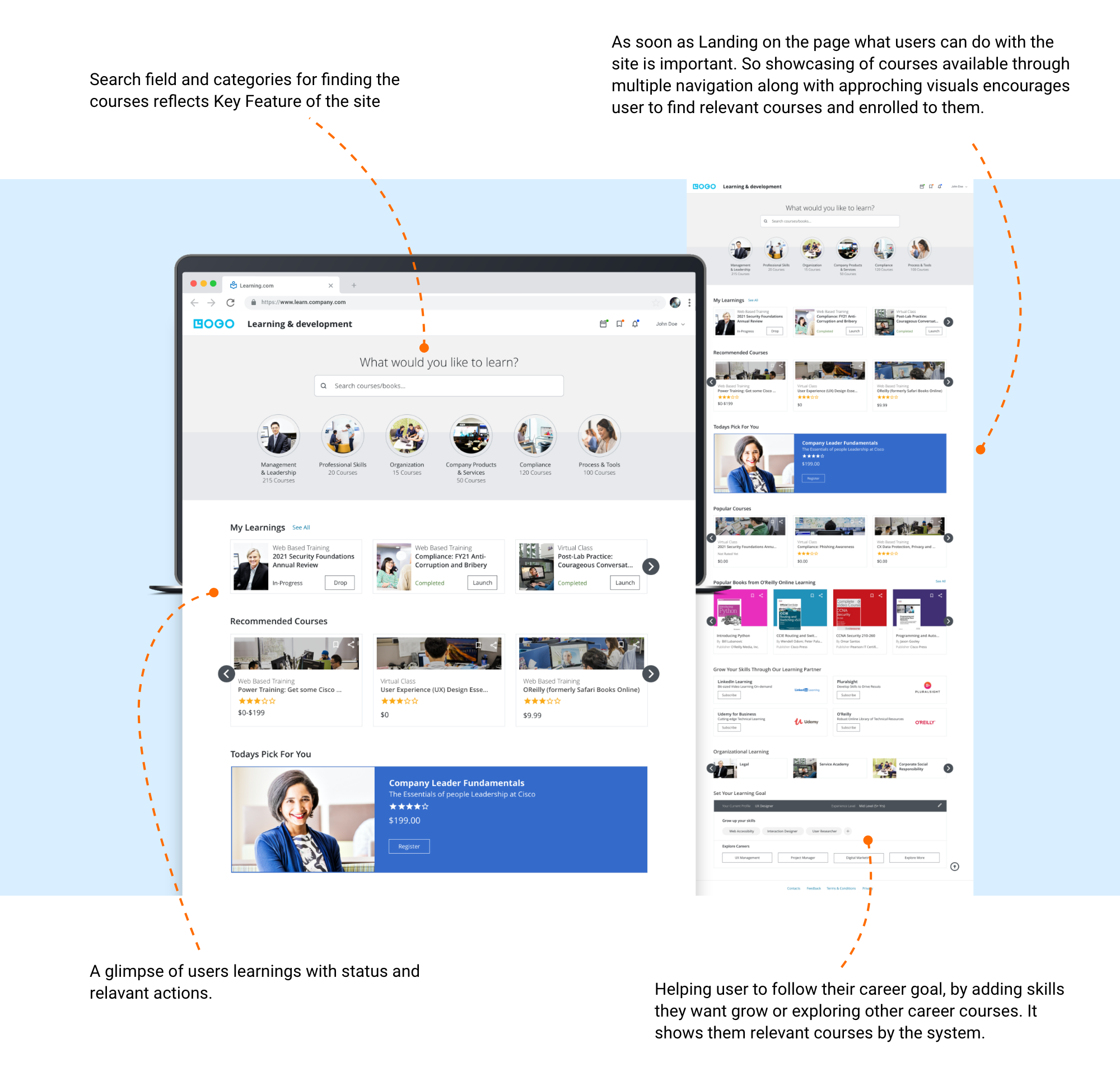
The viewer should be able to view exact courses available relevant to them for their career growth and what they can do within seconds of landing on the learning portal.
Not limiting just search field and categories to find and go for the course, but features like recommended courses, popular courses, or org learning and highlighting categories or top course helps user to find relevant courses through multiple ways.
The importance of Design and Development team collaboration
The most appreciated aspect of this project was the nature of the collaboration between design and development teams. The development team was involved in the design process right from the beginning, which helped everyone from the team empathize with the users and contribute towards creating the tailored experience for the target user.